PG Tips (British)
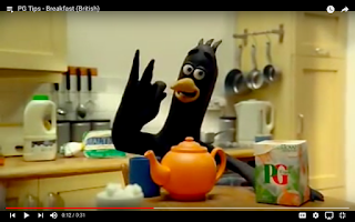
I was drawn in to this advert by the classic Aardman style characters, which played on my sense of nostalgia, as I watched a lot of Aardman animations as a child. The realistic kitchen backgrounds in addition to the characters creates a friendly, wholesome and homely environment. Because of these factors, there is also something very British about the advert, conveying across how the product is exclusive to Britain. The jokey, exaggerated dialogue and slapstick ending helps to give this advert an all-round uplifting tone, helping to sell the product. The use of the actual product in the animation also subliminally makes the audience want to have the product more, as we trust the characters who are sampling it.

Le Chat Detergent (French)
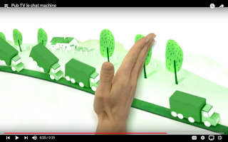
Pixilation and rotoscoping are heavily used in this advert. The interaction with the hand and the drawings is very effective, as the hand is used to show us through the company's history. This in addition to the ukulele music being played over the top gives the impression that the company is honest, and therefore means the audience is more likely to buy it. I'm not a fan of the colour scheme as it makes the world in the advert look too sterile, however as it is an advert selling a detergent product, then I suppose the colour scheme is fitting for the product it is selling. The backgrounds are also very simple so as to not distract from the main action going on, but they can be a bit dull at times. The final scene with the rotoscoped family, fading into the live-action family also helps make the product more relatable.

Evian – Baby Me
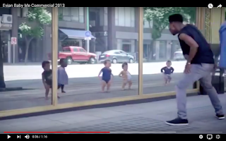
The CGI in this advert when it first came out was particularly quirky and unusual, where the reflections of live-action people in the shop window are made to look like babies. The confused reactions of the actors adds to this unsettling advert, mirroring what the audience themselves are thinking. The clothing of the CGI characters match that of the actors, helping to identify them in their baby form. Altogether this is a very well produced CGI advert, where the babies look almost life-like and accurately follow the actors' dance moves. This is one of the most memorable adverts for its catchy music and dance moves and because of this the advert appears to be a lot shorter than most adverts.

Kodak (Italian)
I found this advert to be one of the more creepy adverts I've watched. The repeated phrases and strangely-dressed characters give the advert an overall unsettling feeling. The advert tries to look aesthetically futuristic, however unintentionally appears dated because of it. The early CGI used for the spaceship, in addition to the pixilation was good for its time though. The animated Kodak film roll also has some personality, and therefore appeals to an audience. The white-fade transition caused by the flash of the film camera was also a nice touch. The music is very Italian as well as the outfits, showing how the advert has been adjusted so as to suit an Italian audience. The colour scheme is also very varied so as to show off the wide-range of colours that Kodak film can print off.

Polaretti (Italian)
The fame of 'Club Penguin' has been used here to help sell the product. Much like with the PG Tips advert, which incorporated the use of Aardman characters, 'Club Penguin' plays on the nostalgia of its audience in order to help sell the product. The characters are even seen tasting the product, along with live-action children, subliminally getting the audience to want the product themselves. The bright colours here also help appeal to children, as they are much more engaging. I like how the 2D characters interact with the real-life objects (such as opening the fridge). Overall however, I find the advert too frenetic, with too much going on, not helped by the fast-paced catchy tune played over the top.
Wrigley’s Spearmint (Russia)
Three large Wrigley's products are seen floating across the sky. They are zapped down to the actors, who try out the chewing-gum. This advert involves CGI that has been overlaid on top of live-action footage. The products do appear as a part of the scenery (with their shadows falling across the actors for instance), which adds a sense of realism and peculiarity. The overall concept however is very simple and because of this it is not the most interesting advert that I have seen. Unlike with a lot of the other adverts, there are not many cuts or short scenes and so it loses pace because of this/becomes more boring. Like with the Kodak advert, it appears more dated now but would have been more convincing a decade or so ago.


