Thursday, 25 February 2021

Documentary Pitch, Research, Moodboard and Ethics

I have teamed up with Madgie, Harry and Daisy to produce a 90 second animated documentary. I chose that we did the documentary on deforestation, as this is a very important issue within the topic of sustainability. I also chose it because I learnt a lot about it from Geography A Level and found it a very interesting topic. We decided to narrow down the topic to deforestation in the Indonesian rainforest as this is where some of the highest rates of deforestation is occurring, which in turn is having huge impacts on carbon stores and climate change globally.

With the idea sorted, we pitched it to the class and got a good response from the tutors. They said it would be a good concept to go forward with and that we were organised for having decided on the mode the documentary would take, our roles and the people that we'd get in contact with for information.


Between the four of us, we split up our areas of research into palm oil (the main crop responsible for forest clearance in Indonesia), slash and burn technique (how they clear the forest), the financial/social side to deforestation (how many Indonesian people rely on this process), and I researched the impact deforestation has on carbon stores. 


I also went back to my old Geography A Level folder and emailed my old geography teachers for more information.


Once I compiled all the research I needed, I created a moodboard of the style I want the animation to be in. I want the documentary to start out as a realistic stop-motion forest set, and throughout the animation, I want the landscape to become more barren (represented through the use of collage). The collage style will link to deforestation through the fact the material is paper (another reason deforestation occurs). 
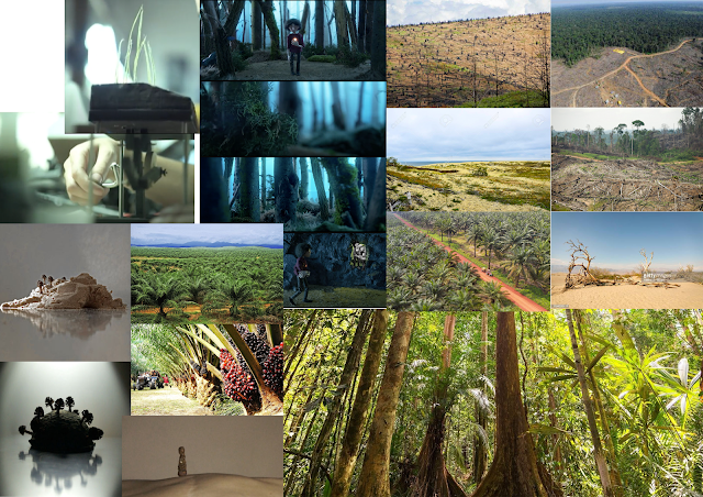


The more research I did, the more I considered the ethics of making the documentary. The lesson we had on ethics conveyed how we needed to protect the rights of the individuals and topics we are focusing on, which can be achieved through the editing, storytelling and way we interpret this issue. I want the documentary to be a warning about how this is such a serious environmental issue, yet at the same time, not making it too pessimistic. Then again, conveying the issue too positively would be just as bad, as it would leave the viewer feeling that they needn't have to take any action after having watched it. This will be an important thing to get right in the script.


What Went Well
  • I'm familiar with the issue of deforestation because of Geography A Level
  • Splitting up the research is more efficient and gets everyone familiar with the topic
  • With all of us creating moodboards, we can pick and choose the style we like
  • There is loads of research online about deforestation in Indonesia

Criticism
  • The realistic sets may be over-ambitious but with a team of four I believe we can create something good
  • Coming up with a message that is both a warning about this issue yet not overly pessimistic/upbeat will be a challenge

Tuesday, 23 February 2021

Animating the Piano Commission

This week I've been animating the piano and puppet that I made as a commission for a friend of mine. I even made another puppet accompanying him on guitar (the guitar made by Daisy). This will be useful for practising my stop-motion skills and something that I can put in my showreel. As I'm working on my own, I'm taking on all the cinematography and lighting duties in addition to the animation and planning, so I can improve these skills as well. 


Pre-edited shots:


My favourite shot to take was of the piano, in which the camera slowly rotated around it while it was being animated. I managed to achieve this panning shot by attaching the camera to a small tripod, which was attached to a microphone stand that was able to swivel. Another tripod then gripped the front of the camera for stability. I was very pleased with the final outcome as it wasn't too shaky.


To make the other puppet, I recycled the monster character I'd made last year. This meant I had to add an extra arm as the monster only had one. I removed the old plasticine and replaced it with clothes that I made from found materials (eg. odd socks/a fabric bag), as I prefer working with this to plasticine. Both the arms snapped in the process as the wire was old, however I was still able to control them enough to be able to animate with them. 


What Went Well
  • This will be good extra content to put on my showreel
  • I enjoyed experimenting with moving camera shots
  • The spotlight and mask tools in After Effects are good for creating an atmosphere
  • I understand more about cinematography and enjoy it a lot

Criticism
  • It took a long time having to sync the action with the song I made
  • I don't want to release the song yet so the video is silent, and parts of it still needed fine-tuning 
  • Green-screening was a big issue, so I had to mask the puppets instead, which was time-consuming
  • Some shots could be lit better
  • The guitarist's arms were hard to animate as they'd both snapped


Friday, 12 February 2021

Giffgaff Instagram and Webpage Banners - Responding to Tutor Advice

I got a lot of positive advice back from the tutors. They liked the Terry Gilliam style of the banners (for instance the long pointing arms that bob across the screen) as well as the visual style generally. Their main points of improving the work was with the text. One of the banner's messages was too long, which I had previously thought as well. In other instances, the text was pushed up against the sides of the banner, and in turn, meant they no longer became the focal point of the banner. One way to improve on this would be to downscale the size of the other objects on screen, such as the pasta maker. Finally, they thought, the text could be animated slightly instead of being static. 


To improving the layout of the text, we asked Harry's friend who studies Graphic Design to help by giving his advice. He was really helpful and gave a lot of advice on how to improve each banner design. These are the final designs that I came up with for the banners:


  • Reduced size of pasta machine and unified the size of the text.

  • Reduced amount of text for readability
  • Added black and white noise bar to the right
  • Moved position of the text to wrap around the objects
  • Moved the doodles to interact with the text

  • Lifted the text slightly so it was central on the banner
  • Added black and white noise bar to the right

  • Added black and white noise bar to the right
  • Reduced the size of the text to give it more room, away from the coin towers

  • Brightened the paper
  • Reduced the size of the animated icons (to give space for the text)
  • Made the text all the same size and equally spaced

  • Brightened the paper
  • Made the text all the same size


What Went Well
  • I more understand the importance of design and how hard it is to get right
  • Getting advice from a Graphic Design student was very beneficial
  • The banners are much clearer now and just as eye-catching
  • There is more emphasis on the text now
Criticism
  • There is so much more to graphic design (e.g. the spacing between lines) that make up the design, however, I'm pleased with what I've created, based on the advice of Harry's friend
  • I had to tweak a few errors after rendering some of the banners as playback was so slow


Wednesday, 10 February 2021

Researching Animation/Art Forums and Networks

Now that I have an art account on Instagram, I've been researching areas beyond this, where I can potentially display my work/ interact with other artists.

Reddit has been a good social media site for finding art forums. I have followed the Stopmotion, the Animation, the Original Content Poetry and the Collage forums. These are good places for displaying work because there is a lot of interaction on these sites (comments on posts/likes) as well as a steady (but not overwhelming) stream of new posts from creators, so my work wouldn't get lost amongst other creators were I to post it up, which is often an issue. The only problem with this site is there are often a lot of rules on what you can and can't post.


Instagram has been a good social media site for following hashtags. I have followed #cutuppoetry, #stopmotion and #collageart. The #stopmotion hashtag was very useful for finding work that I liked, and subsequently getting in touch with animators via email to ask about their work processes. The hashtags are a good way to get found as they are easy to search up, they are open for anyone on instagram to discover and you can use 30 of them per post.


I searched to see if there were any groups on Facebook that were of interest. There was one called 'Stop Motion Movie Making for Everyone', however the problem with this is that it is a private group and so, were I to post my work on it, it wouldn't reach many people, and the group gets over 100 posts a week, so my work would likely get lost amongst other peoples work. It was the same issue with the poetry forums, except they were getting hundreds of posts per day. 


What Went Well

  • This process has been good for displaying my work as well as discovering the work of other people doing similar things
  • Instagram is my favourite place for displaying work as it is the most visual social media site and easy to come across people's work with the hashtags
  • Responses have been very positive from people who have seen my work

Criticism

  • A lot of the time, posts about my work would just get lost amongst everyone else's work and not receive a lot of attention
  • I didn't find much luck on Facebook in terms of finding groups that weren't overwhelmed with the amount of posts they were getting

GiffGaff Instagram and Webpage Banners - Self-Analysing My Work and Improvements

I made some improvements to the banners ahead of our meeting with the tutors, to give them a better idea of the full product we are making for the brief. The only banner I was entirely happy with was the first instagram story that has the phone, coin and globe icons, the others however needed tweaking. 


I removed the static noise bar and replaced it with a faster-paced scribbly background to make it more interesting.


The only adjustment here was colour correcting the red background to fit with GiffGaff's pink colour scheme. 


I colour corrected the dark-blue oil paint swirl to GiffGaff's light-blue colour scheme and I replaced the previously static noise with a loop of three different sections of noise to make the advert faster-paced, as well as reducing its opacity to 25% to improve the readability of the text. A noise bar was added to the right-hand side of the animation.


I added a noise bar to the right-hand side of the animation. With regard to the phone and GiffGaff staff member that slides on screen, I added a full-opacity yellow and red drop shadow to both of these icons. I also had multiple versions of the photos appear on screen at once (as if they leave a trail) to match an effect that Harry used in the 20 second advert. As the photos come to a standstill at either side of the screen, the drop shadows reduce in size and the trails they leave behind dissolve.


I added a transparent noise bar to the right side.


What Went Well

  • The adjustments have made the banners and advert more unified as a collection (eg. colour correcting, noise bars, similar effects)
  • I learnt new tools on After Effects such as how to colour correct
  • This task helped me to criticise my own work in order to find ways of improving it

Criticism

  • Rendering of the banners took a long time and playback was very hard to check for things to change while rendering was going on
  • The width of the noise bars change for most of the banners due to their differing aspect ratios


Monday, 8 February 2021

GiffGaff Instagram and Webpage Banners - After Effects

With animating in Photoshop proving to be such a difficult way of working, I used After Effects to produce the web banners and instagram stories. This was instantly much easier to use (for instance the work I was producing was not getting lost/ changed when I worked on the following frames). When producing these, the main things I had in mind where that they were eye-catching/interesting and that they looped seamlessly. 


The pasta machine layer was brought onto screen using the Page Turn effect. Behind this, the cyclical sequence of the machine's handle is a mask that's slowly revealed as the page turn effect moves across it. The hand with the phone is keyframed using easy ease points and coincides with the sequence involving money being dispensed from the machine. The cash transition that rolls across screen fits with the message of the advert as well as covering up the fact that we didn't have a photo of the hand not holding the phone, so I couldn't have made a loop involving the hand being removed from the machine. 


The painted background is made from oil paint and is a stop-motion sequence of paint spiralling outwards. The hole in this was created by green-screening the spiral out. Once again the Page Turn effect was used for the bin object. The noise bar provided by GiffGaff could move more in retrospect. The pink doodles follow the hand and text and flash/morph, keeping the viewer's attention on the important parts of the advert in the foreground. The text is too long to read for the time that the advert is displayed for. The advert ends the same way it started, being sucked into the spiralling paint, forming the loop.


The loop for this banner is created by two pieces of paper sliding away/towards one another. The coin piles are looping sequences that help keep the foreground entertaining. They also relate to the message, as does the cash transition of the advert, that you can get money for recycling your phone with them. The text is snappy and the colours are in keeping with GiffGaff's brand. This was my favourite banner to make.


This is a simpler style banner that incorporates the Page Turn effect on both hands and they are keyframed out of shot to create the loop. The noise bars are animated here more, however this is a quieter advert on the whole. The gradient (something that features in a lot of GiffGaff adverts) changes between the brand's blue and pink. 


This was another advert I was pleased with. It uses three looping sequences of a spinning globe, a spinning coin, and a phone falling into someone's hand. I 2D animated these three icons in Photoshop before importing the sequences into After Effects. These are laid on top of and project pink shadows on jittering pieces of cutout paper. The noise bar to the right flickers and the oil spiral effect was colour corrected to fit with the brand's use of the colour blue. 


I'm happy with the slow transitioning background to this instagram story, however the green overlay dilutes these noise layers, turning it a red colour, so the background will be readjusted. I'm happy otherwise with the community shot of Madgie, Bethan and Daisy that are on loop. The doodles react to the main actions. The main message is clear on top of the paper cutout. 


What Went Well

  • After Effects is much better for animating in than Photoshop
  • The banners are eye-catching and loop which is what I set out to do with them
  • The banners match a similar style to the 20 second advert, making it an overall clear product bundle
  • The banners keep to the style that GiffGaff have specified in their brief

Criticism

  • Some of the banner's backgrounds will need adjusting
  • One of the banner's slogans are too long for the time given to read it
  • The Page Turn effect may have been overused a bit however by using it in a lot of the adverts, I thought this would be a good way to create continuity between them

Saturday, 6 February 2021

Networking with film festivals

Me, Daisy and Harry looked at possible animation festivals that we could put our animation 'Le Gens du Mur' into. What with COVID restrictions at the moment however, not all festivals are running and all the ones we entered are running online. Even so, we managed to enter into 12 free festivals from a variety of places over the world. We decided just to enter free festivals for now to see if the animation had any luck in these ones, however if it does do well at all, we may consider putting it into competitions that have an entry fee.

The festivals we entered were:
  • Annecy (France)
  • Euganea (Italy)
  • Busheaur (Iran)
  • Animist Tallinn (Estonia)
  • Dead by Dawn (Scotland)
  • Cortoons Gandia (Italy)
  • Kingstoon (Jamaica)
  • Supertoon (Croatia)
  • T-Short (Latvia)
  • Craft (Indonesia)
  • Animafest (Slovakia)
  • Animest (Romania)
I think that festivals are the best way to get our work out there to new audiences and a great way of networking. It will be interesting to see if anything comes about from entering these competitions. *

*(24th March - Our film has been accepted into the 'Student Film's Out-Of-Competition' for the T-Short Animation Festival in Latvia, which is very pleasing.)


What Went Well
  • It was a new experience putting my work into competitions. I now understand this aspect of animation a lot more
  • Festivals are a great way of networking and displaying our work
  • A lot of animation festivals are still taking place online so we were still able to enter these
  • I didn't realise just how many festivals took place and in such a variety of locations
  • It is amazing to hear that our film has been accepted into the T-Short Animation Festival

Criticism
  • I didn't realise so many details were required to enter a film into a competition. Each application took a lot longer than I expected and is very time-consuming
  • We won't hear back from a lot of festivals for a while as some have been postponed
  • As we were submitting our work to a lot of festivals abroad, there was sometimes a language barrier on the websites, making it harder to enter details

Tuesday, 2 February 2021

GiffGaff 20 Second Advert

With all the photos that we'd taken, these needed to be cut out and stylised uniformly. This took a very long time to do and was very monotonous work, however the photos look a lot better for it. For each photo, the camera settings had to be adjusted (exposure, texture, black and white etc.). They then had to be cut around by hand and a white border put around it. Some photos then needed further colour added to it, which again took a long time to achieve. I cut out all the coin stacking sequences, the pasta rolling machine and handle, the cushion and some of the people shots. 


These sequences will be the elements making up the advert, the web banners and the instagram stories. By reusing them across all three of the types of advertisement were making, this will create a uniform style that we're after. The same approach will be taken with the backgrounds and doodles where they will be reused across all the adverts. 


In post-production, I added the doodles to the advert in the same way that I had used them on the web banners. I matched the colour of the doodle to the colour of the object that it was interacting with, so as to attract the eye towards the objects in the foreground without making it overly confusing. The video above is the layer with just the doodles on.

With the doodles complete, it was just the sound left to do. Me and Harry agreed it would be best to use sound effects and some synth sounds. In order to make the voice over as clear as possible, it will be best that we don't overload the advert with sounds however. We have old cassette tape sounds and the clinking of coins, which will complement the objects that are on display in the advert. We even have some thunder claps that may add to the advert's quirky, light-humoured nature. 

I also did some research into the type of music GiffGaff already use in their adverts as a basis of the kind of royalty-free music we could put in ours. Once we'd put the sound effects and voice over in place however, that already seemed to be enough - by adding music, this would overcrowd the advert with audio. This research was still useful for seeing how GiffGaff play around with audio.


What Went Well
  • The bordered black and white photos match the style GiffGaff uses
  • The doodles complement the action and keep the viewer's attention to the foreground
  • The sound effects compliment the objects and the voice over is still clear over the top

Criticism
  • Cutting out the objects and giving them borders was monotonous and time-consuming
  • Harry produced the advert on Premiere Pro, while I made the doodles on After Effects, which caused issues with merging the two together